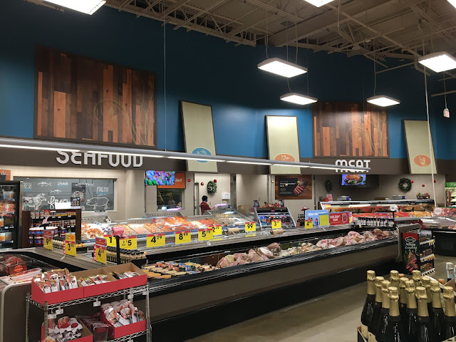
At least there isn't any seafood decor on the meat side of the department to confuse things even further! It's interesting to compare before and after in this department, which looks completely different now despite virtually nothing having changed about the layout (in terms of what you can see from this angle, at least); having the meat department sign above the service counter itself is a big improvement in my opinion, and I've never understood why Northwest so often left that wall space blank.

It's not too often I say this about a modern Kroger renovation, but this Banner scene is a major improvement over how this area used to look!
ReplyDeleteYeah, Banner is one of my favorite Kroger decor packages for a reason! (Along with Urban Mix, so for a few years before Fred Meyer started using Artisan, I actually liked most local Kroger remodels.) It probably doesn't hurt that Northwest is one that I never thought looked very good, particularly on the grocery side.
Delete