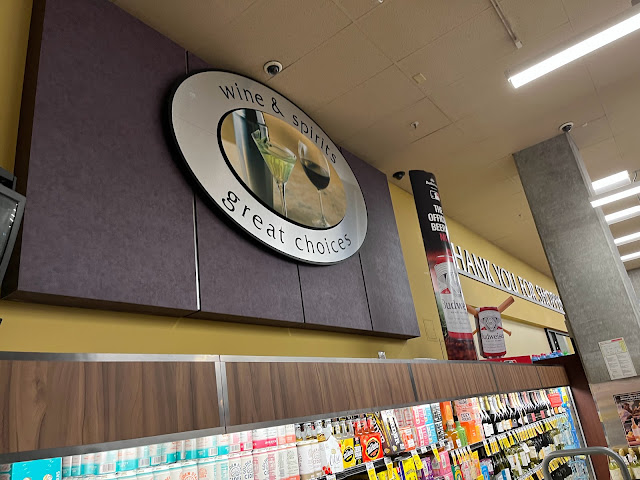
The oval sign for the liquor department is much easier to see, which is slightly unfortunate as it seems to have been screwed up, The other signs of this style are designed to protrude above the backing board, but the backer here is right up against the ceiling, so the oval was also installed right against the ceiling; this panel is also missing the stripe that normally sits below the oval (and there's no obvious sign that it was ever installed), making the unbalance even more obvious. I guess this goes to show that even a fancy new prototype that (being in the region where Safeway was headquartered) probably had a lot of eyes on it can still have installation screw-ups!

Comments
Post a Comment