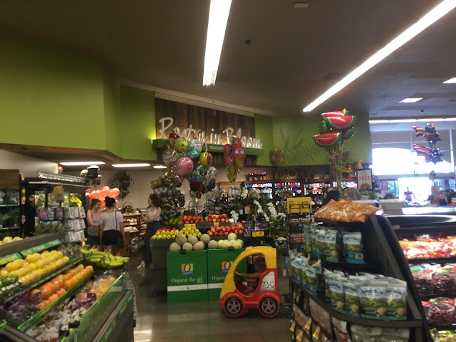
Woodgrain Lifestyle v3 has some cool elements other than the wood paneling, such as the stenciling/decals barely visible to the right of the department sign (we'll see much better examples of that as this set goes on). As far as its main element, the wood paneling, I'm not the biggest fan of this particular style, which looks a bit dated (rather than being modern as in Modern, or retro-cool as in some elements of Artisan or Urban Mix). Apart from that, perhaps the most surprising design change from standard Lifestyle v3 is the elimination of the product photos on either side of each department sign, something that had been carried over intact from Lifestyle v2.

I'm not too familiar with this variation of Lifestyle v3, but I'm liking it already! The wood finish goes well with the green at the very least. This is interesting enough to distract me from the concrete floors that this store seemingly has, lol.
ReplyDeleteHonestly, I don't think anyone is all that familiar with this decor variant! While this store does have concrete flooring, it's stained concrete and actually looks pretty good overall.
Delete