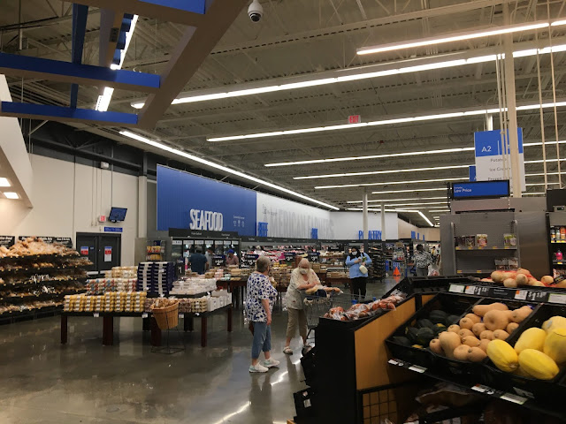
I can't help but feel like Airport is made up of three completely distinct styles, only tied together by the blue accent color and that all-caps, vertically-elongated font: one for the produce/deli/bakery grand aisle (I wonder how that looks in old Supercenters with split deli and bakery departments), one for the meat and dairy departments in that take up the rest of the grocery wall space, and one for the general merchandise side of the store. (Plus, some of the things along the front wall don't fit into any of those three categories.) Here, you can start to see the second of those three zones, with its decor made up of full-height printed panels along the walls (not too different from Black Decor 2.x), with the department signage on stand-alone letters sitting on top of the cases. To Anonymous in Houston's comment the other day, this part really feels reminiscent of Safeway's Modern decor, which also (sometimes) uses stand-alone, case-top lettering like this.

Comments
Post a Comment