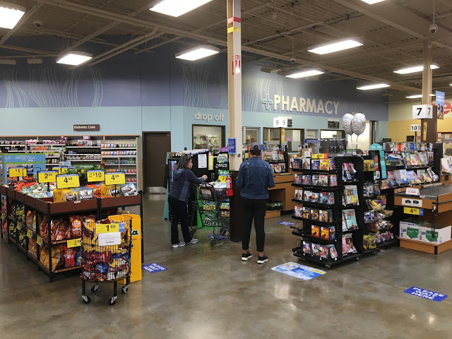
Another awkward thing about this store's layout is the pharmacy, wedged into the front left corner and opening on to the checkouts. (I know some of you think the common placement of the pharmacy in the back actionway in Safeways and QFCs around here is weird, but I think this is much weirder!) The pharmacy decor is typically one of my favorite things about the Marketplace package, and this is no exception. However, not all is as it seems...

I mean, I've never seen one so close to the checkouts like that, but as for the front corner itself, I rarely see anything besides that...
ReplyDeleteSure, being in a corner isn't that weird I suppose, but being right up against the checkouts seems a bit awkward to me...
Delete