Can't study any longer, time for a blog post! I keep talking about the plans for this store, but I also keep forgetting to post them. But hey, better late than never, I guess...
In terms of layout, nothing too major changed, though the liquor aisles were flipped the other direction (to be parallel to the rest of the aisles instead of perpendicular to them), and I think the aisles in front of the pharmacy turned out somewhat differently. You can really see here how wide this store is (at least by northwest standards)!
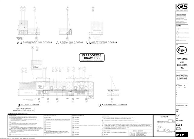
It's when you get in to the decor plans that the real differences become obvious. In the first view in particular, almost nothing looks like what was actually built, with the Wellness sign where that curlicue decoration is shown and a thank you sign where the mural ended up.
I've already mentioned some of the weird changes that happened with the bakery section. It looks like some slight changes were made to the deli and bistro as well, for no obvious reason.
I've also discussed the dairy changes, but I almost missed the much smaller change in the meat department. For some reason, "meat & seafood" changed to "seafood & meat"!
Last but not least, here are the plans for the right side wall, which actually turned out pretty darn close to what was shown.
I really don't know what's going on with all the changes here. I guess Kroger doesn't worry about getting the decor finalized before sending the plans out to bid. Seems rather weird to me, but maybe the main contractor isn't responsible for the decor work, something I have sometimes noticed allusions to in their plans and specs. Either way, it's certainly interesting to see the contrasts!
Tomorrow (I hope), we'll have another special post from this trip...


The "meat and seafood" versus "seafood and meat" thing is definitely weird, but also something l_dawg and I have encountered on flickr before. If a store is right-aligned, it gets the former (probably the default option). If it's left-aligned, it gets the latter. Doesn't really make too much sense, but whatever :P
ReplyDeleteInteresting to hear that it has some relation to the store's orientation... I knew that there was a connection (at least sometimes) to which side of the counter which products were on, which does line up here. Either way, doesn't make sense to me either, since "meat and seafood" just sounds more natural, but who knows 🤷♂️
Delete