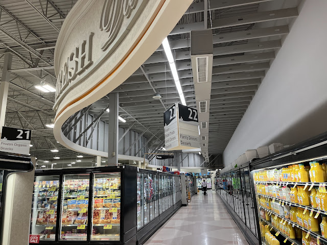
I like this store's frozen aisle a lot better than the SaveMartsons example we recently saw, with no drop ceiling and a less in-your-face flooring design. The aisle marker within the soffit looks a bit awkward, though! It doesn't help that it's missing several plaques, an all-too-common issue with PF&H markers.

The flooring here does look better than the typical Grocery Palace frozen foods flooring (though the peach and teal color scheme is more of what I'm used to), but I most certainly prefer the drop grid ceiling that the SaveMartsons has! This looks quite rough, especially seeing the inside portion of the wavy fascia/soffit. Granted, I know you can see through the grid, so it wouldn't be hidden there either, but it is at least a little hidden especially if one does not look too closely!
ReplyDeleteI'm not a fan of those open grid ceilings, especially with how low they are in these frozen departments. They just look dark and dingy, especially since the original lighting was a lot less bright than this.
Delete