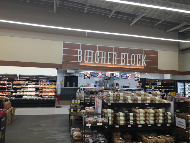
The downsized meat section looks a little bit better than the bakery (at least it got wall tile on the low wall behind the counter, though not on the back wall for some reason), but it's still definitely a downgrade from before the remodel. In the foreground is an egregiously bad example of the mismatched, patchy floors that are a common sight in Lifestyle produce departments these days -- you could also see some of that in front of the bakery counter in the previous picture, but this is even worse.

Huh, that flooring looks pretty bad! I can't say I've seen anything at a Randall's which looks quite that bad...well, I'm not counting the stores which have concrete floors which do look worse. Anyway, I suppose the budget for floor upkeep in your area, as mentioned in the other post, is probably less than what it is at Randall's here! This looks more like something I'd expect from Kroger, but even then they usually maintain the stores with vinyl floors better than this.
ReplyDeleteI don't know if it was maybe a time of day type issue, but it looks like that deli meat case, or whatever it is in the back right corner, is quite empty!
Yeah, it seems like Safeway's budget for any sort of maintenance and upkeep is very limited these days around here. It's like they think they're already part of Kroger! At least their decor doesn't fall apart quite as frequently 😉
DeleteRandom stuff being out of stock (especially perishables) is also a very common problem at Safeways around here, though it has improved over the past year or so. Empty refrigerated cases like that don't really stand out to me any longer!