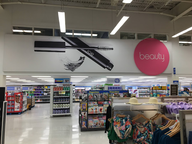
I was about to say that the clothing department looked cheap even compared to Walmart, but then I remembered that they've ditched the woodgrain flooring they used to put in the clothing department, making it similar to what this store has. However, the cosmetics section definitely does look even cheaper than the Walmart version! The low ceiling doesn't help, but the tall shelving, cheap decor, and mismatched lightboxes in the background all look pretty bad on their own. This store's selection and product mix (especially on the grocery side) make it seem a bit nicer than American discount stores, but the interior design really drags it down.
Comments

Huh, those office windows above the floor kind of look like something a factory/warehouse would have so maybe your guess is correct about this being a much older than 1990 building! There's something here which is giving off Coos Bay Fred Meyer vibes, but that Fred Meyer looked nicer than this building with the Paraline and all.
ReplyDeleteI think the clothing here is above the Target and Walmart quality standard. Maybe it isn't above Target's fashion standards, but it isn't falling apart on the hangar so it is probably better quality than what Target sells. Also, the clothing displays don't look ransacked so I think the quality of the display upkeep is well above modern Target standards!
Yeah, maybe! Though it looks like some of the space on the front of the store may have been added by Real Canadian Superstore -- it's hard to tell without higher-resolution imagery though. I have seen some other Superstores of this design that have similar two-story front ends.
DeleteHa! I haven't bought clothing from Target or Walmart in many years (I hate shopping for clothing, so I normally buy it online), so I don't know what it's actually like. Canadians are normally better than Americans about not making messes, but the kids' clothing section in the pictures after this one was looking a bit messy!