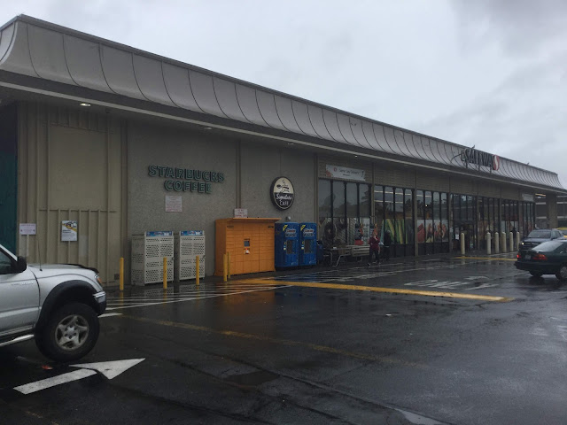
I quite like this store's exterior look, so I ended up taking quite a few photos of it despite the wet and dreary day! When this store got its Lifestyle v2 remodel and new exterior signage, they left the space where the old square-S logo was very obviously empty, which is kind of fun to see from a retail fan perspective, but it definitely would have looked better if they had installed a new sign there.

Comments
Post a Comment