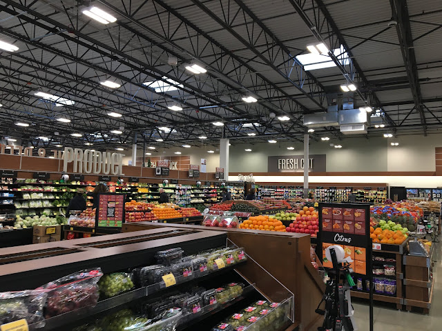
While this store's produce department does have a little bit of wall space, its main department sign is still the "floating" style, something I always like! The wall got a "fresh cut" sign, which isn't something I've seen very often in Modern stores; its grey background also seems to be a bit too small, or at least too short (they're normally the same height as the wood grid backdrops).

Comments
Post a Comment