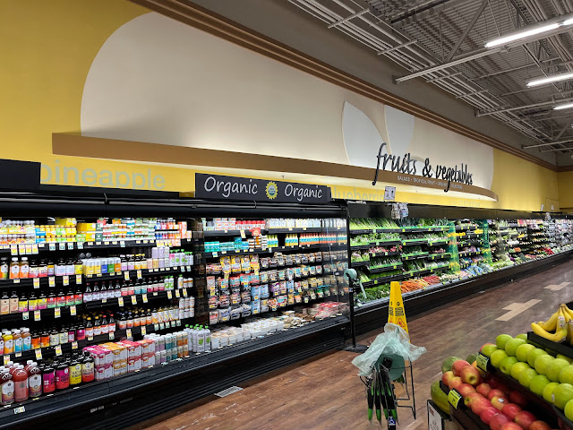
I guess to make space for the produce items in the deli, Albertsons decided to move some deli items to the produce section... because that totally makes sense. Or at least that's the best explanation I can think of for whatever is in the "organic" case! The produce department here is quite unusual compared to any other PF&H store I've seen, featuring the names of various fruits and vegetables written along the wall (in a very plain sans-serif font) and dark woodgrain flooring that looks pretty close to what Modern ended up using (most PF&H stores didn't have special flooring in the produce department, and the woodgrain flooring that was used in some parts of the store was a very light version, similar to what was used to patch this floor off to the right).

Huh, who knew kombucha was so popular? Then again, this is California after all! I've seen some grocers use the 'new-age drinks' title and that would probably fit here, lol. Perhaps Albertsons figured that the kind of people who drink kombucha are the kind who don't shop past the produce aisle!
ReplyDeleteIf you didn't describe what is in this picture, I would have guessed those light patches in the floor were actually cardboard! Hey, I've seen it happen at Macy's a time or two, lol.
Shameless plug time! I know I've alluded to this post a few times before, but The Year of Kroger post I wrote about the 1987-built Houston Safeway, now Kroger, with the diamond shaped interior and the subsequent layout which is most bizarre has now gone live. You have to see this one to believe it, it is very strange. You'll need the included store map to make sense of the stour. Added to that is the double security catwalk and one of the strangest integrations of an in-store bank that you've probably seen! Most of the oddities you'll see in there are Safeway ideas so it'll be interesting to see if you've ever seen anything similar in your area since Safeway left Houston almost right after this store was opened. This TYOK post is a 2-for-1 post as it is about two Krogways near one another which have similar elements, but the other Krogway is a less strange. It's still pretty neat though given that it is still a bit different than the typical Kroger property. Link: https://houstonhistoricretail.com/2023/11/01/two-westside-kroger-stores-with-unique-safeway-and-appletree-designs/
Safeway around here tends to keep kombucha and similar stuff in the produce department too -- that's where it is in basically every store except the ones with a dedicated juice section (which is normally near the produce section anyway). What I'm confused about is the case next to that!
DeleteThose are some interesting stores -- I'm definitely glad you included the floor plan to help explain that weird layout! It kind of reminds me of those 90s "diamond windows" Rite Aids, but that's definitely even weirder! If they ever built any stores like that around here, they're long gone now -- neither the interior nor the exterior look like any Safeway I've ever seen.
The "organic" case looks like it has tofu and vegan "meats" in it. While it's odd to have that stuff in the produce department, I'm pretty sure Publix does the same thing. I'm also pretty sure Publix sticks kombucha with regular juice (which is also usually near produce).
ReplyDelete