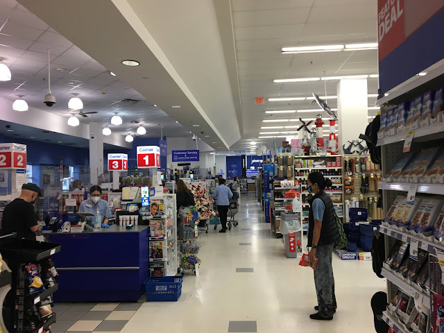
Continuing on to the front end feels like going back in time to the 90s -- heck, those register lights look even more outdated than the ones they actually used in the 90s, somehow! The diagonal ceiling grid and pendant lights above the checkouts are also basically the same design London Drugs had been using for well over a decade before this store was built, as is the flooring. There are plenty of retail chains out there known for having seriously outdated stores, but I can't imagine there have been all that many that actively built stores with the level of old-fashionedness London Drugs did here!

Comments
Post a Comment