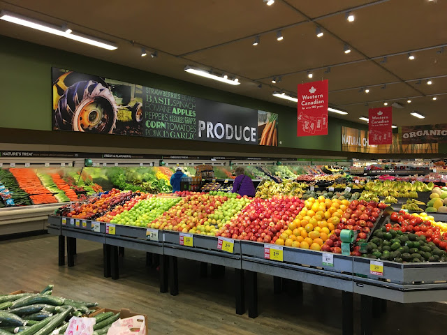
Safeway may be strongly associated with dark stores, but this Save-On decor package takes that to the next level, featuring perhaps the darkest paint scheme of any decor I'm familiar with! At least they've brightened up the lighting somewhat compared to the Lifestyle days, but this store still has a very different atmosphere to it than the brightly-lit, light-colored designs that I'm used to seeing. On a separate topic, what the heck is going on with the map on those "Western Canadian" signs?? The first thing I noticed is that they placed the Yukon more or less where southern Alaska is, but pretty much everything else about the map is bizarre too.

Ha, I'm not sure what's up with that map of western Canada. It almost appears that it was designed by eastern Canadians or something!
ReplyDeleteIn many ways, this produce department reminds me a lot of a Blue & Grey Market Krogertsons...or maybe even an Albertsons itself, but certainly my memories of these stores are fresher as a Krogertsons than as an Albertsons given that I was just at a Blue & Grey Market Krogertsons today, lol. The colors aren't like anything Kroger uses. Well, maybe Script, but not really even then.
Speaking of the Krogertsons, I went to pick out a frozen pizza from the case and I grabbed one which expired in January 2023! Fresher than Fresh! But, hey, we could be here all day if we started making random complaints about Kroger, lol.
Yeah, the long produce displays are definitely reminiscent of what Albertsons used to use! (And probably still uses in some stores, but most of the ones around here have been replaced with Safeway-style square fixtures.)
Delete