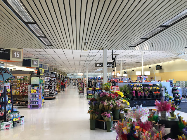
In addition to the physical separation, the low ceiling in the corridor between the two salesfloors adds a level of visual separation and furthers my feelings that this was an intentional design choice, for whatever reason. In addition to its space by the garden center, the floral department also occupies the space right inside the entrance to the store, beyond which the remaining front checkouts unfold. I really wish I had been able to find a pre-remodel picture of this portion of the store, so I could confirm whether there were always checkouts here or if these were added as a replacement for the set in the grocery side; either way, it's just bizarre that Kroger decided to get rid of the grocery ones.

Comments
Post a Comment