After taking last week off, it's time for another look at the Pinehurst Safeway remodel! Pretty much all of the new decor is in place by this point, including the welcome signs in the vestibules (sadly, still just saying Seattle instead of the neighborhood name as I would prefer!).
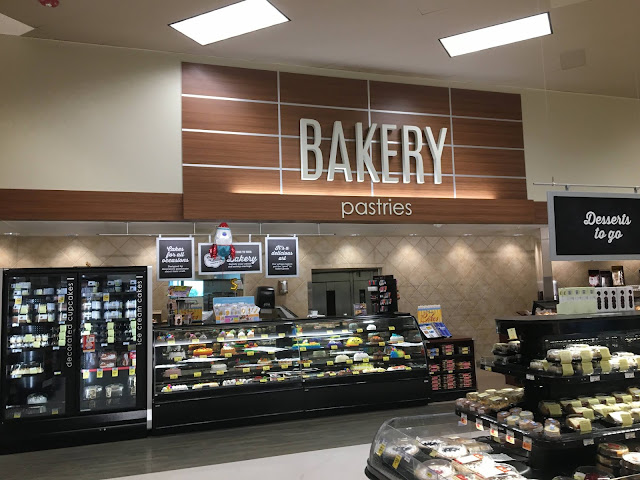
The bakery sign was finally put back together, and looks quite nice as always. I'm not a huge fan of wood paneling, but the grid of wood pieces in this decor looks surprisingly nice. As is common for these remodels, the Lifestyle tile and faux-wood flooring was left (even though, as in most Lifestyle Safeways, the faux-wood was looking a bit worn out), while the nice beige vinyl was replaced with my absolute least favorite store flooring, small white vinyl tiles.
This is a rather funny angle, but here's a look at what's probably the rarest wall sign in local Safeways (and, honestly, most grocery stores around here): Frozen Foods! Unlike in some areas, frozen foods is almost never a perimeter department around here, with ex-Grocery Palace Albertsons being the only stores that have that as their standard layout.
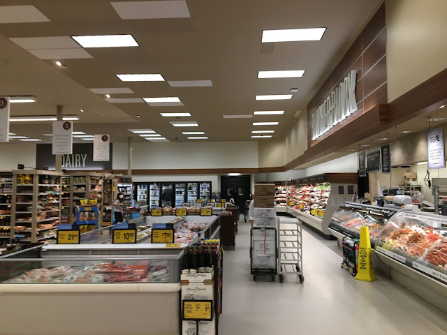
Here's a look at the meat department, rebranded Albertsons-style as the Butcher Block. I velieve some of the original spotlights were left in place here, pointing at the old wall decor (look at the wall to the left of the new sign) -- I wonder if that was somehow intentional, or if the electricians just forgot to remove them when they installed the new 2x4 fixtures.
So remember how that little angled wall was the first part of this side of the store painted a few weeks back? Well, apparently the painters used the wrong color, as it's now been repainted from green to the dark grey used as a background for secondary department signs! Juice is another rather rare Modern Decor sign, and it's particularly odd here seeing as this store doesn't have an actual juice department (like some larger, standard-layout Safeways do in the back of the produce section), just a few cases in the dairy section.
Oddly, a line of spotlights was left in place above the central cut-through aisle when the lighting was replaced. Anyways, the department sign that I was worried about being half in the aisle was actually placed fully outside of it (off to the right), though the aisle does look down to a paint transition at the far end which does look a little odd. And there's still nothing in the top slot of any of the aisle markers, which I was really hoping would be used for the local place name lines that show up in random stores with this decor.
Yep, that's a giant inflatable pizza slice hanging in front of the closed cafe! I'm guessing that's a pool float, though I'm not sure where you'd find a pool big enough to use that (and that would actually allow you to) around here. Anyways, here's a look at the grand aisle, which looks pretty much done at this point other than the patchwork of ceiling tiles (I certainly hope that's going to get fixed before this remodel is considered over...). I kind of wish Safeway had put some real decor on the wall of the deli island facing the entryway -- in the original decor, it had a "Signature Cafe" sign and product picture, but now it's basically just a blank wall. (It seems like the Signature Cafe branding is mostly dead these days, which is interesting as Albertsons/Safeway has significantly expanded the "Signature" branding in other things, especially their store brands.)
I'm still holding out hope that the rather blank white look of the right-hand wall isn't the final look, but at this point I imagine it's not going to change. It seems like a Brown Decor "Bread and Rolls" sign would fit nicely in the space between the two groups of windows (where it originally was), or at least they could have extended the wood trim across the space (replacing the original trim that was just painted white). The bakery sign was finally put back together, and looks quite nice as always. I'm not a huge fan of wood paneling, but the grid of wood pieces in this decor looks surprisingly nice. As is common for these remodels, the Lifestyle tile and faux-wood flooring was left (even though, as in most Lifestyle Safeways, the faux-wood was looking a bit worn out), while the nice beige vinyl was replaced with my absolute least favorite store flooring, small white vinyl tiles.
No clue what happened here, but the brand-new sign for the wine department now has a patched hole in one corner of it! Someone has a bit of a punchlist item here...
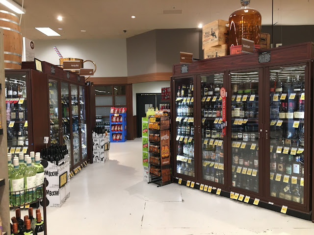
Here's the liquor department, which saw minimal changes other than new woodgrain category markers. The brand-new vinyl floor here is already looking a bit worn out, which in my opinion looks way worse than the patchy concrete floors that so many stores have.
Nothing too exciting in this picture, just another look down the back aisle. I love how non-busy this store tends to be compared to other Safeways I've shopped at -- not only does it make photography easier (just look at this nearly people-free shot!), it's much more pleasant for shopping too. This is a rather funny angle, but here's a look at what's probably the rarest wall sign in local Safeways (and, honestly, most grocery stores around here): Frozen Foods! Unlike in some areas, frozen foods is almost never a perimeter department around here, with ex-Grocery Palace Albertsons being the only stores that have that as their standard layout.
Here's a look at the meat department, rebranded Albertsons-style as the Butcher Block. I velieve some of the original spotlights were left in place here, pointing at the old wall decor (look at the wall to the left of the new sign) -- I wonder if that was somehow intentional, or if the electricians just forgot to remove them when they installed the new 2x4 fixtures.
So remember how that little angled wall was the first part of this side of the store painted a few weeks back? Well, apparently the painters used the wrong color, as it's now been repainted from green to the dark grey used as a background for secondary department signs! Juice is another rather rare Modern Decor sign, and it's particularly odd here seeing as this store doesn't have an actual juice department (like some larger, standard-layout Safeways do in the back of the produce section), just a few cases in the dairy section.
Oddly, a line of spotlights was left in place above the central cut-through aisle when the lighting was replaced. Anyways, the department sign that I was worried about being half in the aisle was actually placed fully outside of it (off to the right), though the aisle does look down to a paint transition at the far end which does look a little odd. And there's still nothing in the top slot of any of the aisle markers, which I was really hoping would be used for the local place name lines that show up in random stores with this decor.
And finally for today, here's a look down the front end, featuring one of the Thank You signs. Lots of the new wood paneling has been installed around here too, clashing with the old wood flooring.
Anyways, I'm thinking I'll post one more update when this remodel is done, which may or may not be next week. We'll see! Anyways, normal content will resume tomorrow.


Comments
Post a Comment