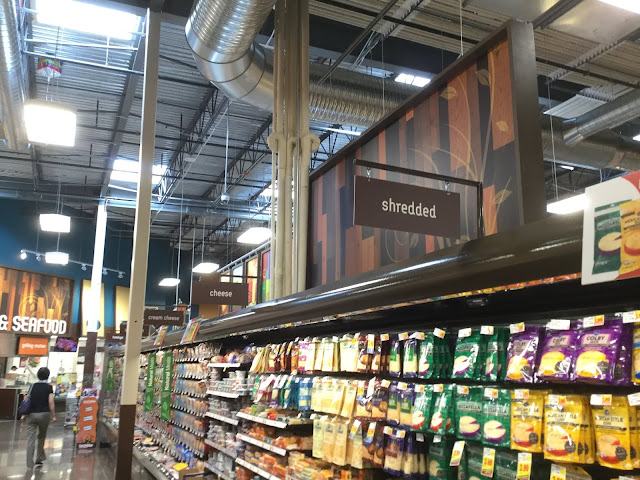
By the way, that woodgrain panel in the background is the back of the "Beer & Wine" sign seen a few pictures back. It's really nice to see the attention to detail put into pretty much everything in this decor package!
By the way, that woodgrain panel in the background is the back of the "Beer & Wine" sign seen a few pictures back. It's really nice to see the attention to detail put into pretty much everything in this decor package!
Comments

Yes, nice to see indeed! And I totally agree about the attention to detail. This is a nice package.
ReplyDeleteIf only they could have done something like this throughout the store... it's a bit odd to have the ones with the generic font since the Marketplace decor uses it's distinctive font everywhere else.
Delete