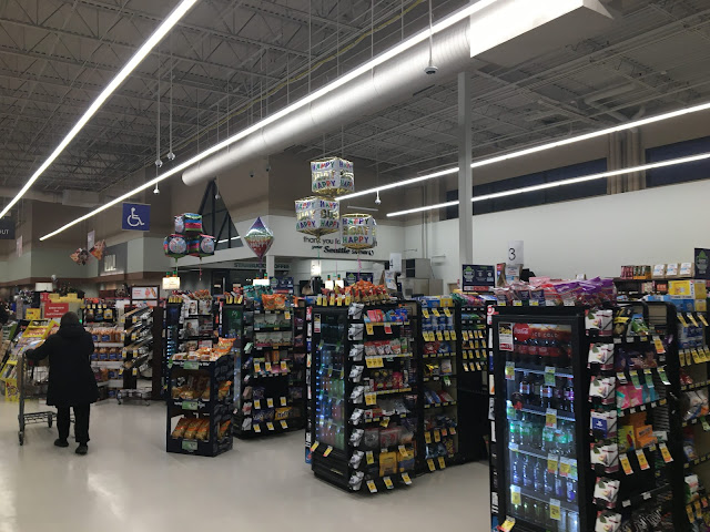
The only major change made to the front end was the addition of offices in the low-ceiling portion, which actually makes this area look significantly less strange than it did before. It probably looks even better when it's not wintertime and there's actually natural light coming in those clerestory windows!

Huh, maybe I'm missing something, or maybe the registers are blocking something from being visible on that front-end wall from this angle, but that front-end wall looks very plain and white! It almost looks like a plain white wall from Artisan or something. Hopefully it isn't really that plain because I'm sure that wouldn't look very nice just to see a plain white wall!
ReplyDeleteThere's shelving and stuff along the wall, so it doesn't look that weird in person. Looks like the top of that shelving lines up almost perfectly with the top of the impulse-buy checkout shelving in this picture!
Delete