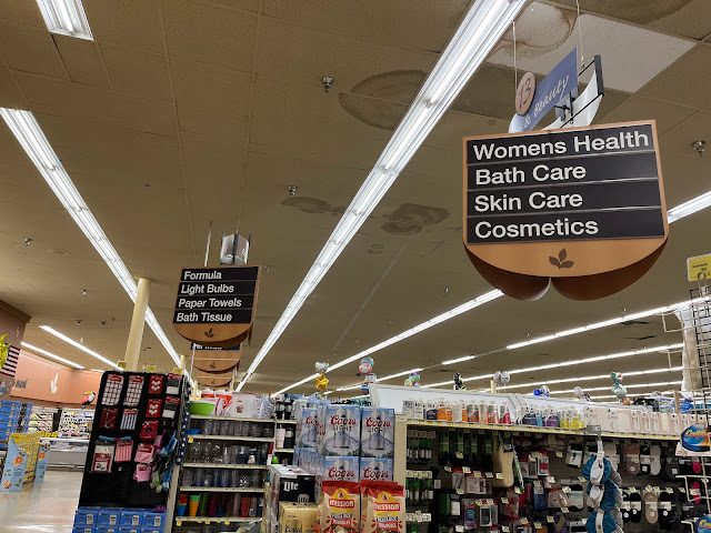
Here's another angle on this store's extremely strange aisle markers. As you can see from aisle 13 (which has a somewhat damaged sign -- these seem to have held up much better over the years than the normal PF&H signs, but they aren't perfect), the health and beauty department got the same powder blue accent color as normal PF&H, the only bit of color-coding that made it into this package. Aisle 12 in the background shows how the top part isn't centered on the tri-sider portion of the aisle marker, which looks strange from this angle but not so much from the normal angle you would be looking at these. And I'm not sure why the Albertsons leaf on the bottom is a bit wonky -- I guess the large leaves on the walls are also angled, but having the aisle markers all lined up and all with the same slightly-leaning leaf definitely looks strange.
Comments

While I did notice the slanted Albertsons leaf logo on those aisle markers, which I assume is done to match the leafs on the wall, that was certainly not the thing which caught my eye in the thumbnail or the photo itself! You can probably guess what did catch my eye...that ceiling! Eek! It is a shame because otherwise this store looks to be pretty nice even if the layout is strange. Maybe it is a Lucky thing. It certainly doesn't look like our Eagle by Lucky stores, but those were kind of discount supermarkets anyway.
ReplyDeleteHuh, I suppose Albertsons has that one weird aisle with socks, sewing supplies, and stuff like that in it. I usually associate that with Kroger at least here in Houston. I hadn't noticed them at Randall's, but they probably have it too.
Yeah, I feel like I've talked enough about this store being a bit rough, but this bit of ceiling is extra terrible!
DeleteEven my small local Safeway has part of an aisle full of that sort of random household stuff. They cleared out a lot of it when they did a big reset earlier this year, but they still have a few shelves full of that sort of random overpriced stuff that I don't understand why anyone would ever buy. It's nowhere near as large of a selection as what you can see in this picture, but it's still strange!
Those aisle signs look really weird!
DeleteAlso, I just have to throw in that I agree about the ceiling being atrocious!