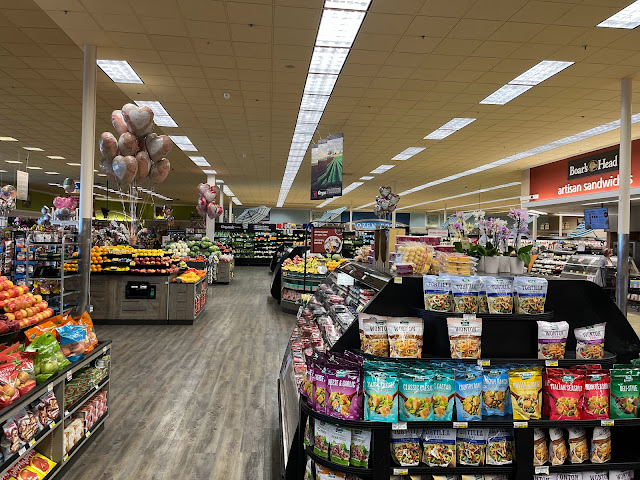
Turning around, here's a view back across the produce department. Those three hanging banners are interesting -- they look very much like the ones Safeway used in the earlier days of Lifestyle (I think you'll recognize that store!), but with completely different content (and with font styles like what Safeway used in the late 2010s) -- I'm curious if they're recycled (repainted) old signs, or if it's just a coincidence.
Turning around, here's a view back across the produce department. Those three hanging banners are interesting -- they look very much like the ones Safeway used in the earlier days of Lifestyle (I think you'll recognize that store!), but with completely different content (and with font styles like what Safeway used in the late 2010s) -- I'm curious if they're recycled (repainted) old signs, or if it's just a coincidence.

Comments
Post a Comment