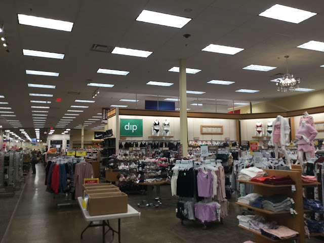
And so does the random folding table with cardboard boxes on it! The clothing department here is all kinds of strange, from the odd layout to the decor that seems to be torn between going cheap and going upscale, to the massive overabundance of merchandise. It's odd to see this here, in a store remodeled before Kroger decided to largely give up on apparel.
Comments

Ha, nothing says classy like a chandelier and folding tables with cardboard boxes on them! This is about the level of confusion that I would expect from the modern Macy's. I suppose at least Fred Meyer was in good company in that regard!
ReplyDeleteThe odd chandelier aside (I think I've seen something similar, though even more daft, at photos of HEB Plus stores), the clothing department doesn't look too bad here. It does have a Mervyn's 1990s type vibe to it. I suppose that was when Target was pushing the 'Mervyn's California' name. Say what you want about Mervyn's, but they did look nicer than many modern clothing stores.