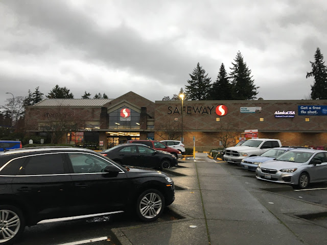
I took an extra-large number of photos of this store's exterior since I like it so much! I'm glad this store got its Lifestyle remodel in the v1 era, since a lot of early v2 remodels painted over the exterior brickwork, which never looks anywhere near as good as the original design, particularly at a store with extra-decorative brickwork like this one. This store doesn't appear to have seen any notable exterior changes with its 2018 remodel either, keeping its older signs (for a long time after the current logo came out, Safeway would only ever use black signs, which didn't look all that great on darker brick stores like this one; in recent years as they pushed to finally bring the 15-year-old logo to all of their stores, they started using white signs when it would contrast better).

Comments
Post a Comment