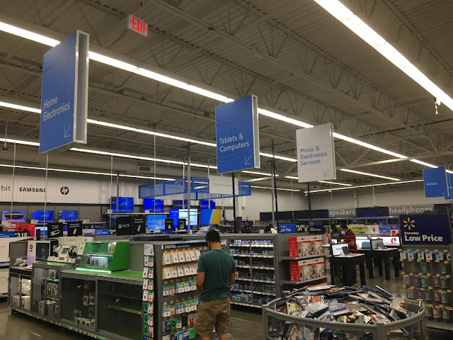
The electronics department is a good example of how Airport has a ton more signs than previous decor packages: while Walmart historically would have used only a single sign for the department, now it has a bunch of signs for individual parts of the department. Unfortunately, it also reveals a bit of a flaw with this design -- the department feels rather unbalanced here, with a bunch of signs close together in the foreground, and then a big gap in the background. Plus, the "Tablets & Computers" sign doesn't seem to be pointing to the right place...
Also, those category markers on the shelves in the foreground are very obviously Black Decor 2.x. I'm not sure if they were a leftover (this store's previous decor was Cheap Impact, but the electronics department could have been refreshed at some point), or if they were installed during the Airport remodel.

Comments
Post a Comment