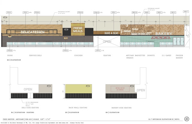
The decor plans for this store are particularly interesting because you can see some of the evolution of Fred Meyer's take on Artisan here. Normally, when these plans are posted, there are two parts -- a smaller-scale details set and a larger-scale set of elevations. And normally, they match... but not here, where the details were clearly an earlier draft than the elevations (and neither completely matches what was actually installed, but that's about normal for Fred Meyer).
Normally, I don't bother showing the details sheets, just because there's a lot of them, and they tend to be in a very weird order. But here, there are some interesting things to note. For one, toys and the indoor garden section are flipped in these plans compared to reality. (The garden center signage is on a later sheet.) Also, the flower cutouts look much nicer in the plans than they actually turned out -- I'm not sure if there was an issue with installation or if the concept just doesn't translate well to real life. Oh, and there's an exclamation mark in the "thanks for shopping" sign, oddly enough.Moving along the front wall, this sheet shows the front end. Chase is still shown in these pictures, while the electronics decor was still shown as TBD, and the Brands/Quality sign was still Kroger blue.
Interestingly, this plan sheet seems to indicate that new decor was planned for the Fred Meyer Jewelers department at some point -- who knows how far along that design went, but I doubt we'll ever see Artisan's Fred Meyer Jewelers decor since Kroger is giving up on that line of business.
The only big change I can see on the grand aisle is flipping the Artisan Breads and Bakery signs. This arrangement probably makes more sense, with the bread sign blending in to the word collage.
Again on the back wall, not much changed, except that the dairy sign was originally intended to be a lot taller than it actually is.
And then here's the garden center signage, showing that it was intended to be adjacent to the outdoor garden department at some point. I'm curious why they changed it -- this seems to make more sense in some ways, being right next to the hardware section.
Fred Meyer clearly hadn't decided just how little decor they wanted for electronics at this point, though the blank wall placeholders aren't too far off from what we got in the end!
Perhaps the most interesting change is in the clothing department. Rather than the Artisan chevrons, this department was originally intended to get "Dip decor by Dfab", which presumably would have looked more like what we saw in Greenwood, and which I haven't seen elsewhere. I'm beginning to think that Fred Meyer has at least two stores where they experiment with decor ideas that often don't come to fruition -- one of which is Greenwood, and the other of which is one in Portland that I'll hopefully be posting about sooner rather than later.
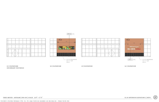
Nothing much to report in the vestibules, so on to the (presumably newer) decor elevations! Starting again in the front left corner, the garden and toy departments are still backwards, and there's still an exclamation point in the thanks sign, but everything else I noted was updated -- the electronics decor, Brands/Quality sign, and bakery and bread signs.
Around the rest of the main salesfloor, the dairy sign is still oversized, and now there's a picture next to the garden shop sign, which doesn't appear in the final build. I'm pretty sure the electronics department walls are a bit more bland in reality than shown here, too.
The clothing decor looks about right for what was built in the end, though.
And another small interesting note -- apparently, Fred Meyer was considering whether or not to remove the big box above the produce prep area. I feel like it would have looked better if they had left it in place...
Anyway, that's it for this store! I'm not sure if anyone else finds this type of post as interesting as I do, but it's quite interesting to me, so I'm glad I was able to find these documents.


This is interesting stuff... some of the changes they made were for the best, like getting rid of that totally unnecessary exclamation mark in "thanks for shopping," and swapping the two signs in the bakery.
ReplyDeleteIt's quite strange to see that they didn't have electronics décor at first -- perhaps this store was the very first one to need Artisan signage for that department? -- and I guess as a result of that, the super-plainness of the final décor for that department can be explained not only as a wider reflection of Artisan, but also as a practical "quick and dirty" solution to the décor issue!
As for the jewelry décor, I've always interpreted "décor provided by others" to mean that Kroger simply won't be making any changes in that space, not necessarily that new décor is on its way. So most likely a new Fred Meyer Jewelers décor wasn't ever in development after all.
It does sound, however, like the store was going to get a very Dip-inspired clothing section -- while it's probably for the best that it didn't go overboard with that, I'm a little surprised it didn't at least get one Dip sign, like that Greenwood store you linked. (Unless it did and I've forgotten already, haha!)
Oh, and also -- I'm pretty sure D|Fab designs all of Kroger's décor packages! Or at least most of the ones I've seen...
Oops -- meant also to comment on the fact that they were apparently still debating those two produce department options even after the elevations were published. Perhaps that's more common than I think, but it just feels very weird to me that something like that wouldn't have been decided much sooner in the process!
DeleteAs far as I know, this is the first Fred Meyer to get Artisan, so I'm sure they were still working out the Fred Meyer-specific details. Sadly, it seems like they punted and went with super boring designs for most of them, with the boring electronics department and endless extension of the dairy decor style into the home and hardware sections. We'll see if anything changes if/when we see more Artisan remodels (it will be interesting to see when that happens, since Fred Meyer might still be remodeling some stores to Banner).
DeleteI'm used to drawing a distinction between "by others" (meaning someone else will design and/or install something) and "existing to remain", but that's from non-Kroger projects. Perhaps Kroger's projects mix up that terminology... who knows. Not that it necessarily means anything, but the later plans changed it to "Fred Meyer Jewelers Existing Decor".
I didn't see any permanent Dip signage here, just the normal promotional stuff. Perhaps they realized it's a bit of overload! As I've mentioned before, I've also never been a fan of permanent signage mentioning store brands, since those tend to change around fairly frequently. I know Kroger put a lot of money into Dip, but who knows how long that will last, since they're not so into the Marketplace concept these days from what I've heard.
From what I can tell, DFab does design most of Kroger's decor packages, but they aren't involved with every store. This one doesn't mention them anywhere on the plans -- instead, they say "CDS", which I'm assuming is the one that's done Albertsons decors.
And it's not entirely surprising that not everything was finalized -- after all, there were still other changes from the "final" plans to the actual construction (which almost always seems to be the case). I mean, they still moved a few whole departments around after the project went out to bid! Heck, when I watched the Ballard remodel, they changed some things around after construction had already started!
Yep, exactly. And concerning any further Banner remodels -- do let us know if you find any, because I'm thinking that package may finally have been retired for good in the Marketplace and Fred Meyer stores! I've only seen it set for regular stores in my area, with all the Marketplace remodels switching to Artisan...
DeleteYeah, Kroger might mix up that terminology; not sure. I'm pretty sure I've seen that even for the typical guest services sign they have in every store down here, but since that décor piece also hasn't changed design in so long, I'm never sure if they replace it or the existing one stays intact XD
Yep, makes sense about the store brand signage. As for Dip, fair point, but I think as long as Kroger is going to keep selling apparel, Dip will stay around... I doubt they decided to switch the department over to their own brand without the intention of sticking with it in the long haul rather than just a few years (unless, of course, they do drop apparel entirely from all of their stores!)
Yep, makes sense -- they're the designers, but not always the installers.
Wow!
Honestly, I haven't seen a lot of full remodels recently, but their half-remodels have been with Banner elements, not Artisan elements. Going through the Kroger list, I've found a few recent remodels with Banner (Lynnwood being probably the most recent), but I haven't been able to pin a date down for any of them. I didn't find any new Artisan remodels, either. And I haven't seen any plans show up in the usual places, so perhaps Fred Meyer just isn't doing major remodels currently.
DeleteAh, gotcha. Remodels have been ramping up a bit more around here based on the plans that I've seen. Unfortunately, they're all for Remix :(
DeleteHa, in that case, I guess I'll take what we have!
Delete