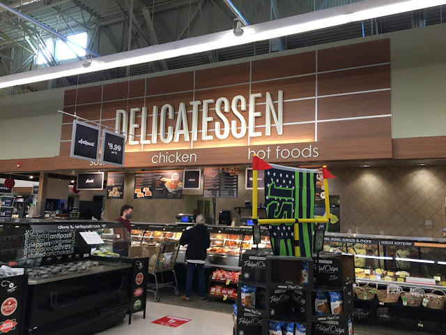
Heading back up to the actionway, here's a look at the new "delicatessen" sign, and the all-but-untouched deli below it. I still kind of wish Safeway had actually bothered to replace the wall tile, even though whatever they would have came up with to replace it surely would have looked super cheap. The old tile just doesn't go with the aesthetic of the new decor, in my opinion. (Probably not as bad as Marketplace Decor Fred Meyers retaining the wall tile from their previous decor packages, but still...)

Comments
Post a Comment