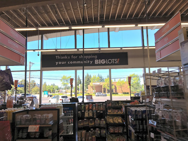
Here's a straight-on look at the new checkouts, as well as the new "community Big Lots" sign that I still think looks like someone forgot to swap out the placeholder text. You can also see the aisle markers, showing that this is the food section (and also has the highest aisle numbers in the store, which seems a bit odd). I really had to edit this picture to make it usable -- it seems like Apple has optimized their cameras for landscape pictures (which they love to feature in their ads), at the expense of interior pictures... and when it comes to something like this, it just gets confused and makes a beautiful landscape photo that's not even remotely what I'm trying to do. Ugh.

I mean, it *is* a beautiful landscape photo though :P
ReplyDeleteHa! It was a very weird-looking picture before I edited it...
Delete