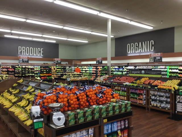
Interestingly, it looks like those odd produce cases were retained in the remodel. Perhaps they are the new Safeway style after all, and I'm just not used to it since Safeways have been keeping their old Lifestyle-era ones when they get remodeled. Anyways, the produce department looks even better than before following the remodel, though the use of the plain grey background for both the signs is a bit unusual. (I almost thought the installers messed up and installed the "organic" background on the prepared foods sign and vice versa, but this is how it is on the plans, for whatever reason.)

Comments
Post a Comment