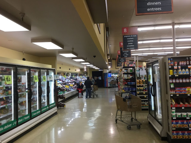
Here's another picture showing how odd the back of the store looks, with the lowered ceiling across the back aisle. The aisle markers don't look too bad from this angle (though they're clearly rather close to the wall), but it's kind of weird to not be able to see the wall signage from the back aisle. Those light fixtures under the soffit are unusual too, and don't look very Safeway-like to me for whatever reason.
Random side note -- as I was writing this description, this song (starting lyrics: "Welcome to the edge of decay...") started playing. Feels appropriate in more than one way here...
Random side note -- as I was writing this description, this song (starting lyrics: "Welcome to the edge of decay...") started playing. Feels appropriate in more than one way here...

Comments
Post a Comment